这一节课是请其他老师来讲的,内容非常丰富,以至于时间到了还没讲完,但是老师把PPT分享了,所以可以自己看看。
主要内容就是数据的可视化,或者说如何才能更好的把数据展现出来,课上举了一些好的例子和不好的例子。
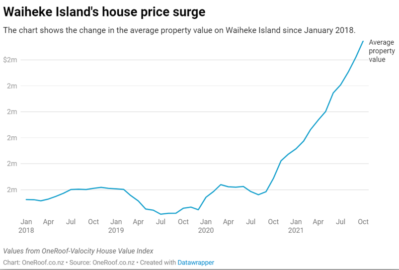
下面这个图,纵坐标没有变化,都是2millions。
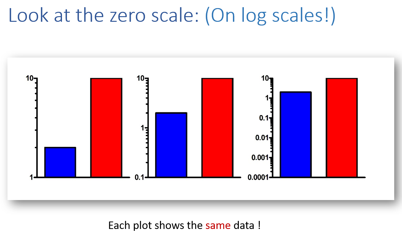
而下面这个图,同样的数据通过修改纵坐标的范围可以展现出不同的效果,这也是新闻的常用手段。
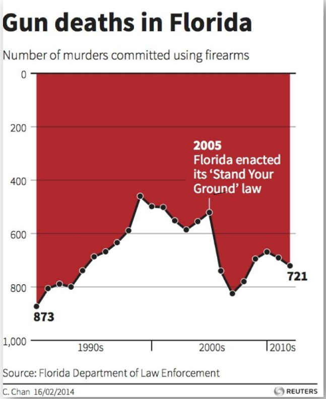
而这个则是坐标和数据弄反了
下面链接给了很多不好的例子
https://www.statisticshowto.com/probability-and-statistics/descriptive-statistics/misleading-graphs/
像这种就属于还不错的例子,颜色分明,重点清晰。
总之就是各种案例,那么要避免不好的点。
有一个需要注意的是,不建议用Excel因为功能有限,做不出好看的表格,建议用R,Python,Matlab之类。首选Matlab。